“Gate”, a small house with a dynamic interior by mihadesign

from 2nd bedroom’s interior window | © Sadao Hotta
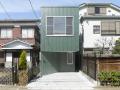
This small Japanese house is fairly unremarkable on the outside. It is interesting enough with its green metal cladding and inset entry, but not particularly outstanding. Step inside though and the Gate house leaves a very different impression. For such a small house it has an extremely visually stimulating interior. There are unexpected openings and views no matter where you look.
The Gate house sits on a narrow lot in Tokyo. With only 4.5 m (14′ 9″) of width to work with, the house had to be long and skinny. And with neighboring houses sitting close by on both sides, there was limited opportunity to provide views to the outdoors from all rooms. Instead, the architects from mihadesign created a dynamic interior to engage the occupants at every turn, substituting interesting internal views for external ones.

view up from dining room | © Sadao Hotta
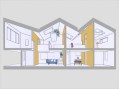
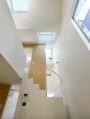
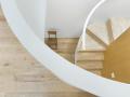
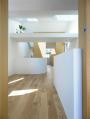
The Gate house was designed for a family consisting of a couple with one child. The home’s 88.4 m2 (951 ft2) of floor area is organized by way of three wood-finished load-bearing walls that extend up through both floors to support the roof. These three walls divide the length of the house into four zones, defining the major rooms. Multiple openings in these wood-clad walls frame views from one space to the next. Likewise, openings in the upper floor create views between the levels. Looking through a framed opening, or a series of openings, creates visual interest because it prevents you from seeing the full extent of the space beyond. As you move around, you may get glimpses of different parts of the space beyond the opening.
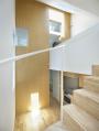
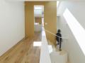
The two bedrooms are on either end of the upper floor, separated by a long hallway. This hallway is quite wide and winds between two openings in the floor, resulting in several distinct nooks. Depending on the occupant’s needs, these nooks could be put to a variety of uses such as storage space, a home office or a nursery.

from hallway to master bedroom | © Sadao Hotta
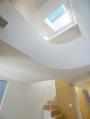
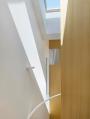
The roof zig-zags up and down along the length of the house. It would have been easiest, from a construction or structural point of view, to have the roof valleys coincide with the load-bearing walls, but the architects chose not to. Instead they introduced another element of surprise by having the roof planes dip low and change direction unexpectedly in the centers of rooms. One space has the ceiling peak off-center, creating an asymmetrical volume. A plant shelf suspended across the space adds further layering and interest to the overhead view. Light flooding in from multiple skylights draws the eye upward, ensuring that the dramatic roof geometry won’t go unnoticed.
Click a thumbnail to view a larger photo, then click on the photo to advance to the next one.
-
- © Sadao Hotta
-

- © Sadao Hotta
-
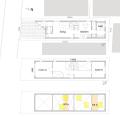
- floor plan
-
- section
-
- view up from living room | © Sadao Hotta
-
- view up from dining room | © Sadao Hotta
-
- from stairs to dining room | © Sadao Hotta
-
- from stairs to 2nd bedroom’s interior window | © Sadao Hotta
-
- view up from stairs | © Sadao Hotta
-

- view up from stairs | © Sadao Hotta
-

- view up from stairs | © Sadao Hotta
-

- from hallway to 2nd bedroom | © Sadao Hotta
-

- from hallway outside 2nd bedroom | © Sadao Hotta
-

- from 2nd bedroom’s interior window | © Sadao Hotta
-

- from loft in 2nd bedroom to hallway | © Sadao Hotta
-
- from hallway to master bedroom | © Sadao Hotta
-

- from hallway to master bedroom | © Sadao Hotta
-
- view down from hallway | © Sadao Hotta
-
- from master bedroom to hallway | © Sadao Hotta
Photographs © Sadao Hotta, courtesy of mihadesign. Via ArchDaily.
Text copyright 2012 SmallHouseBliss. All Rights Reserved.
