Thoughtful details enrich a modest cottage

This two-bedroom cottage is located on the island of Utila in Honduras. A single-level residence, it’s the type of small house often found in retirement communities across North America. It appears to be a fairly low-cost home. The layout is pretty humdrum and it is finished with builder standard drywall and laminate flooring. But even when building on a tight budget, relatively inexpensive features can have enormous impact, as architect Mark Zacapa demonstrates here.

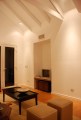
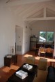
On entering the cottage, one of the first things you’d likely notice is the cathedral ceiling. The trusses are most likely purely decorative with no structural purpose. However they add interest and draw the eye upwards to the exposed rafters and the V-groove board finish of the ceiling. At least it appears to be finished with boards when looking at it from floor level. However as the ceiling is painted, it could just as easily be inexpensive paneling or sheets of plywood with a groove routed every few inches. With a couple coats of paint, you wouldn’t be able to tell the difference without climbing a ladder for a close look. Nevertheless, it adds richness and texture to the space at little extra cost. Building the home with standard roof trusses and a flat ceiling would definitely have been cheaper, but can you imagine how boring and closed-in the space would seem with a flat drywall ceiling?
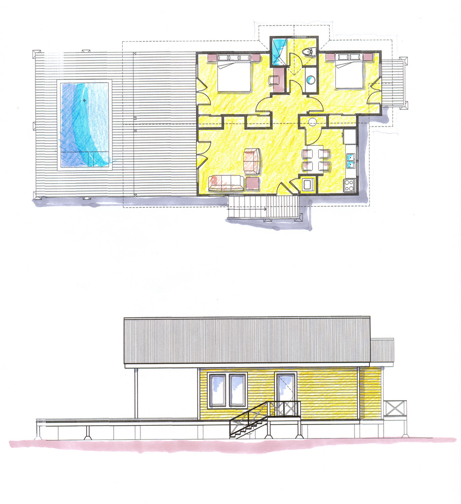
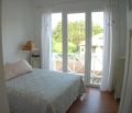
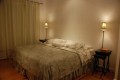
Another noteworthy feature is the row of closets down the middle of the house. They separate the privates areas on one side from the open plan living area on the other. Closets don’t sound too exciting at first, but here they have a subtle impact on how the house is perceived. The depth of the closets means that instead having the bedrooms right on the other side of the living area wall, you have to reach them via a short hallway. It may only be a couple extra feet but it increases the sense of separation by quite a bit, and the house feels larger as a result.

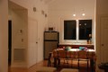
Having the bedroom doors set back from the living room wall also adds a sense of solidity to the house. The house feels more substantial, as if that extra wall space were the result of a two-foot thick masonry dividing wall. By contrast, a door that is only a few inches from a corner creates the impression of flimsiness. It would have been better if the door to the utility closet in the kitchen had also been moved farther from the corner.

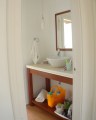
The architect took advantage of the available depth to add an alcove in the living room, further contributing to the illusion of a thick wall. The alcove breaks up what would otherwise have been a large blank wall surface. The walls have also been dressed up with baseboard and window trim that is a step up from the narrow clamshell molding often used by builders to cut costs. With the use of paint-grade trim, it is a fairly inexpensive upgrade that has a big impact.
Click a thumbnail to view a larger photo, then click on the photo to advance to the next one.


-
- floor plan

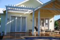
Photographs courtesy of Utila Real Estate Company.
Text copyright 2012 SmallHouseBliss. All Rights Reserved.
